When editing my images I used a free website that was called BeFunky. This website has a lot to offer as you can go from your basics such as cropping to maybe more advanced things such as things like blemish fixes etc.
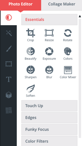
To start with I simply uploaded the image I wanted to use and selected the 'Essentials' tools. I mainly just used the 'Crop' tool to get rid of any unwanted areas on my images so I could just focus on the main point. I could also adjust the lighting and contrast if needs be. I only used this if my image was too bright or too dark.
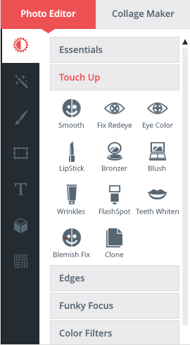
Next I selected the touch up tool. This is where I was able to do things such as touching up my models makeup, getting rid of blemishes and wrinkles, whitening teeth and softening the skin if needs be.
After if I wanted to change the over all effect on my image I selected the next tool box which was an image of a little magic wand with stars coming from it. Here you are able to pick from a number of effects for your images this can range from black and white to Vintage colours etc.
On some images I sometimes wanted to add some special effects to them effects such as different lights going across the image to give it more of that edgy sort of unique look. I did this by selecting the very last tool box which is in the shape of a square and seeing which effect best with my image.
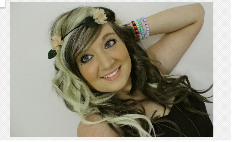
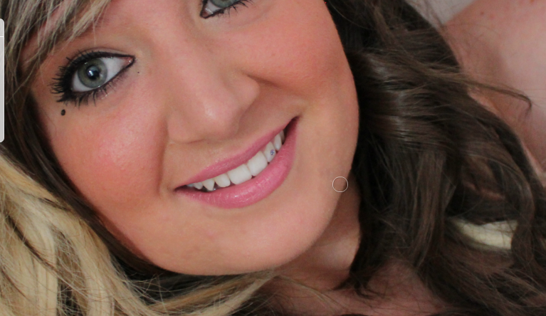
Here I have added some examples of an image I have edited by using BeFunky. This is the original image I started with.
Here I have simply used the 'Colours' tool which comes under the 'Essentials' tool bar. I then simply changed the amount of 'Hue, Saturation and Temperature' I wanted.
Here I have simply whitened my teeth and changed my lip colour. I have done this by going to 'TeethWhiten' and 'LipStick' this comes under the 'Touch Up' tool bar. With the teeth whitening you simply have to select it then set the brush size, hold down the button on your mouse and rub over your teeth. With the lipstick you simply need to select it, pick the lipstick shade you want, set the strength and hold down the button on your mouth and rub over your lips.
Here I have used 'Blemish Fix.' T
his comes under the 'Touch Up' tool bar. This isnt the best picture to use to show an example of blemish fix but on my chin you can see very small spots. You are able to get rid of these by using the blemish fix tool, you simply need to select blemish fix, select your brush size and then
hold down the button on your mouse and rub over the area you want to cover.
Before
After
Now I have simply changed to the 'Effects' tool bar so I can change the whole effect of my image, here are some examples.
Here I went to the 'Chromatic' option box and selected the 'Chromatic 1' effect, I then simply played around with the Effect amount to see how much I wanted to apply to the image.
Here I went to the 'B&W' option box and selected the 'B&W 8' effect, I then simply played around with the Effect amount to see how much I wanted to apply to the image.
Here I went to the 'Summer' option box and selected the 'Summer 2' effect, I then simply played around with the Effect amount, Highlights and Shadows to see how much I wanted to apply to the image.
Here I went to the 'Vintage Colours' option box and selected the 'Vintage Colour 2' effect, I then simply played around with the Effect amount, Highlights and Shadows to see how much I wanted to apply to the image.
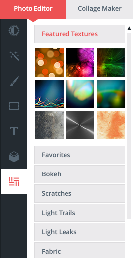
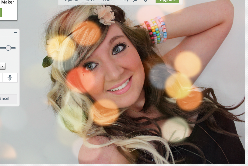
The last thing I did was add some special effects to the Image. I simply went to the special effects icon and selected it and this is what comes up.
To get this effect on my image I simply went to the 'Light Trails' option and selected the first light trail, I then played with the opacity and the positioning of the effect.
To get this effect on my image I simply went to the 'Bokeh' option and selected the last effect, I then played with the opacity and the positioning of the effect.


.JPG)


